Friday 26 November 2010

Generation Press

The wonderful Generation Press came in to talk to us today as our 'Friday Visiting Professional' and he brought Anand back with him! It was a good talk and they brought lots of gorgeous printed material for us to rummage through and keep what we wanted pretty much. Very nice of them.

It was a good talk and interesting to listen to. It makes me want to visit GP but with no money and no transport that's a little bit difficult for me.

They brought us a present too, which therefore sets the bar for all visiting professionals in the future.


Specifically for us, ooer.


It was a really nice white foil that the photograph didn't  really pick up the detail of. Anand is their adopted northerner so it's sort of a running joke.

Wednesday 1 September 2010

Quakers Oats


I completed an old D&AD brief over the summer to bulk up my portfolio with the kind of work that I enjoy doing and here is it completed!

The brief was to create packaging and point-of-sale for a new Quakers product 'Oat So Simple'.

Tuesday 10 August 2010

Envelopes


Some branded envelopes for the letter (and eventual compliments slip) to be sent in. I found some envelopes at home that were plain on the outside but had a great, bright inside, I loved it and wanted to incorporate the look. A bright yellow envelope would be too garish in my opinion and look like junk mail trying to catch the attention but with a yellow inner, it's much more subtle and in my opinion, classier.

Sunday 8 August 2010

Letterhead.


Letterhead design. Ohhh thank you typography module.

I should probably do to a compliments slip as well.

Thursday 5 August 2010

Finalised business card idea


The business card so far. It's to be made of a thicker stock with the edges colored yellow. I'm not sure how I'll go about manufacturing this just yet but this is what I have in mind.

Monday 2 August 2010


Playing around with the business cards

Sunday 25 July 2010

Saturday 10 July 2010

Tuesday 1 June 2010

Freelance CDs


One of two freelance pieces I did as part of a collaboration with Leigh Wortley for two music students. The student for the above booklet, not the best client in the world, he was constantly wanting things changed and pretty much, not letting us design, he came to us with a very firm image of what he wanted in mind and gave us absolutely no leeway. He was very finicky over the slightest details and had me wanting to punch him in the face multiple times. but I refrained, just so you know. In the end, we had pretty much no design input into it at all and we weren't happy with the end result. But he was. We offered him several (much better) alternatives but he was adamant to have it exactly his way. Definitely a case for Clients from Hell.


The client for this one couldn't have been better. He couldn't have been happier with what Leigh and I produced for him and was chuffed to bits, which was really nice to see. Complete contrast to his friend. This is the one that leigh are I are so much happier with how it turned out as we were pretty much given free reign over it so we were very pleased with the outcome.
-HJ

Sunday 30 May 2010

OUGD203 Evaluation

Here is my ridiculously long evaluation for OUGD203.

For the first part of the Design Practice 2 module I chose to work with Carl Holderness on the YCN Fedrigoni brief. We chose to tweak the brief a little bit, working out what the problem really was and trying to see how we could fix it. We worked out that the basic problem was that not enough people were using the Fedrigoni London Showroom, and that we had to get more designers to visit and use the space.

It wasn't mentioned anywhere on the brief that we were given, and it took emailing Fedrigoni ourselves to get some additional information, but we finally found out that only Fedrigoni customers are allowed to use the space, and that it is free for them to use. This would have been a really useful piece of information to put on the original brief as it was an important part of how we moved forward. We decided pretty early on, through designs and mock ups that we wanted to create a piece of direct mail sent out to Fedrigoni's existing customers, and that we wanted it to have an element of interactivity, and so went about trying to make a model of the room and something that would pop up into a little model of the room.

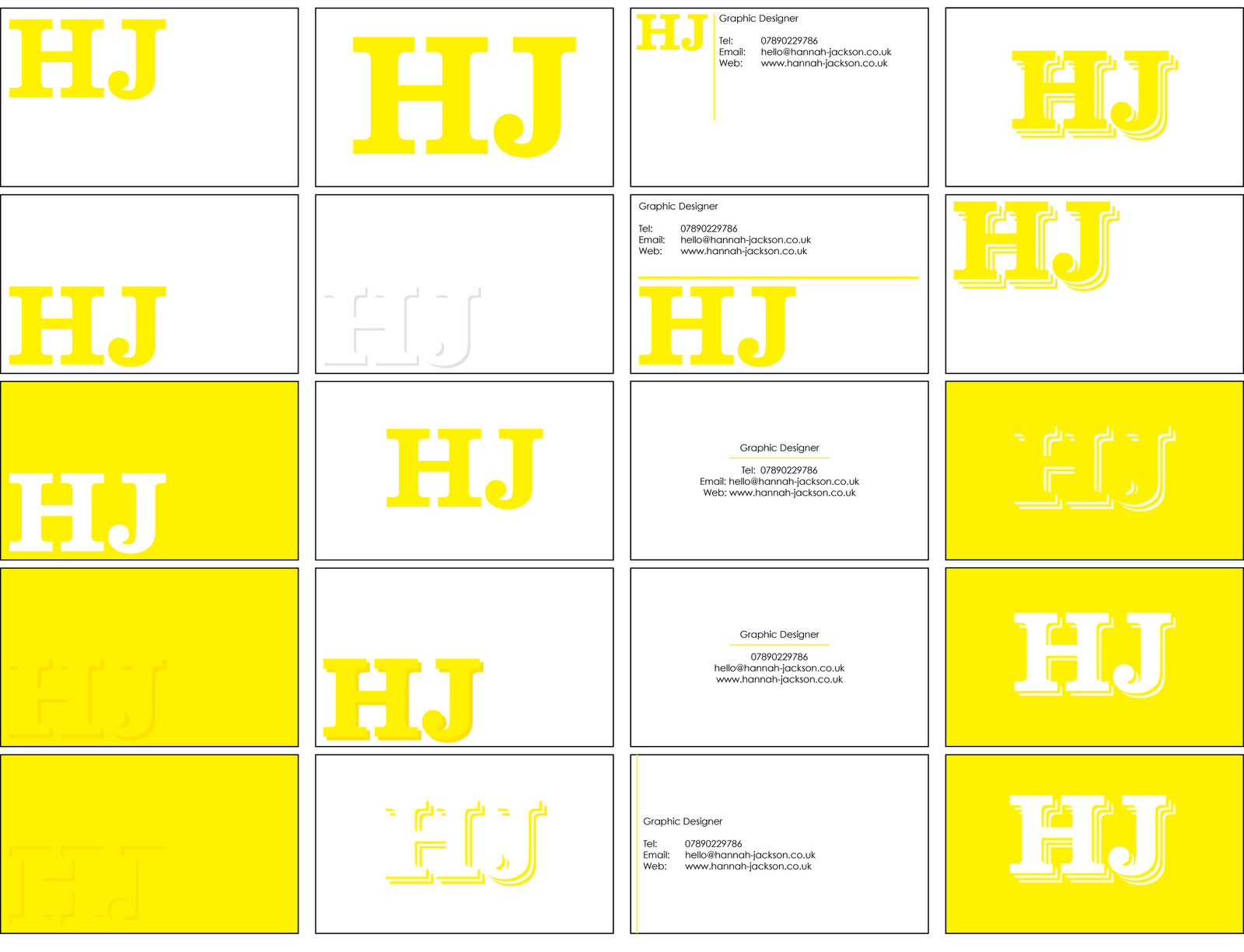
We also had an interest in working with information graphics, using all the information that we had about the room and the additional information that we had gotten from Fedrigoni, so the little paper mock up of the room was designated as a business card for the London Showroom.

We essentially rebranded the Fedrigoni London Showroom as 72m(squared - I can't find the glyph on here), which was the area of the showroom itself, and this was what sparked off our interest in information graphics.

Another decision that we made pretty early on was to use only two colours plus stock, the spot colour blue of the Fedrigoni logo that we were sent and black, on white A2 paper, the first idea was to create a poster representing all of the information that would be sent out to Fedrigoni customers, though during a crit we were told that it wasn't high impact enough, so we turned it into a series of 4 A2 posters that were very high impact and a random one would be sent out with paper orders to the existing customers.

When we requested paper from Fedrigoni, (it was very hard to get anything out of them) they arrived in a nice sleeve with a selection of paper inside, we decided that the poster needed to be sent with the sample packs as well to appeal to potential customers as well as existing ones.

The boards and the posters were printed out downstairs as well as the Business cards, although they kept printing out the wrong shade of blue until we changed printers and they came out just fine. I was really impressed with what Carl and I produced between us and I feel that we shared the work out evenly. We had no disagreements or fights and so I think that it was the perfect collaborative project.

This was the first time we had to do design boards that were being sent out, so we had to get them absolutely spot on and I learnt a lot about what needed to go on the boards when designing them.

I also kept on top of my blog throughout this project, with images and writing about them throughout and I think that this was a really good idea and I intend to keep on top of my blogs in the future.

What I would do differently:

- Make sure my files are saved int he right format when going to print.
- Spell check first, and not have my computer set to American English


For the second part of Design Practice 2 module I chose to write my own brief to repackaging Homebase's 'Grow Your Own' product range. I chose to work on this brief because I am greatly interested in Design for Print and packaging and so wanted to do some more work in this area and create a nice portfolio piece.

I started by doing research into the previous entries to this finished D&AD brief and by going to my local Homebase to have a look at the existing product range and see what needed to be done. I also conducted a small interview with a Sales Manager to find out which products were the best sellers and which ones didn't sell so well, and what seemed to be the problem. The answer came to light that the problem was that the range looked too much like all of Homebase's other products and so didn't stand out from the rest. The audience of the Grow Your Own range is novice gardeners, and another problem was that they weren't sure what other equipment they needed to go about growing their own fruit and veg, so from this I decided that I needed to create kits that included everything the customer would need to make it easier. This was a decision that I made very early on in the project.

The best selling products ended up being strawberries, tomatoes, carrots and peas, so I decided that I was going to make a starter kit for each of these products.

I really got into the idea of sustainability during this project and started to explore it and see what I could do with the packaging and how I could make it as sustainable as possible. I went through several ideas of how I could do this, including instructions for how to make your own little plant pots out of newspaper and making the actual box itself something that could be planted in the garden as a plant pot. I started to make mock ups as I couldn't really get my head around how it would work when just working on paper, I had to start working in 3D. I had several ideas of how I could do this and started to discard them once I had mocked them up and realized that it wouldn't work, or it wasn't the right size and such. It was a case of trial and error.

I finally settled on the idea of making the box out of cardboard, which is biodegradable and helpful when growing plants as it generates heat, and having the box as something that will be planted in the garden. I decided that I had to have the size and shape of the box before I began designing something to go on it.

I went through a long process of designing the graphics to go on the box. I decided that I wanted to focus on a mixture of type and image for this, trying to adapt a typeface to the shape of a seed/a leaf to link it to the subject matter. I also wanted to keep with the sustainability side of things and try to print using only one colour, using one colour per product. This turned out not to work so well so I had to revert to using two colours plus stock, which was cardboard.

The original idea was to include a bag of compost inside the kit so that the customers would not have to go and buy an additional grow bag, I wanted to try and put everything needed inside the box, though it eas proving to be difficult to package this without the use of plastic. I finally managed to create a seamless box net with no holes in the corners or at the folds.

When I finally got around to mocking the box up properly for the show and tell session, I found that I really didn't like it when it was all put together, it just wasn't aesthetically pleasing to me in the slightest and I wanted to change my design. I had to scrap the limited colour plus stock idea, and I started to experiment with photographs of the product, making shapes with them and experimenting with the colours. I changed the stock from cardboard to recycled card, which was white, and a much better stock to work on, as cardboard woulc have had to have been screen printed in the college because it wouldn't go through any of the printers here.

I put it together so that the sides of the box could be turned into different parts of the product, therefore re-using the box and keeping the sustainability idea going. I also swapped the bag of compost for a set of coir (coconut fibre) plant pots and soil pellets which expand when water is added. This took up a lot less space and allowed me to use a lot less materials when constructing the box. I had several sizing issues and kept making (major) miscalculations and kept having to resize the box, though I finally settled on a smaller one, that was the right size for the product. One side of the box can be split down into marker sticks to put into the soil with the seeds, and the instructions also can be torn off and kept.

The original idea for the digital side of the project was to create a website illustrating recipes that can be made with the fully grown fruit and veg, though during a crit the idea to make an iPhone app was suggested. This is appropriate to my changed audience of novice gardeners aged 20 - 30. The iPhone app is designed to send out alerts to remind the customer when they need to water/repot/harvest their products. It also includes the instructions for in the case of the customer losing them. I feel that the iPhone app was a much better choice than the website and feel that it is really appropriate to the target audience that I chose for the brief.

I am really pleased with how this project turned out, I ended up exploring several ideas and taking them further before I finally decided on my chosen resolution, so I feel that I really exhausted the best of my ideas and experimenting with them before moving on to my final products.

The main problem that I encountered during this project became apparent when I was putting the boards together. They went together just fine on screen though I had issues when it came to printing them and I ended up having to print them twice because I was not fast enough or early enough to get a print slot booked in the Digital Dungeon so I had to print my boards in two halves on the laser printers. The first time I mounted them, I mounted them onto thin card, which flexed as I was laying them down and so they were full of air bubbles and they just looked really bad, so I had to reprint them and mount them onto mount board, which went much better, though took me right up the deadline when I was hoping to be finished a little earlier than I was.

I feel that I really did well with time management during this brief, I was mostly on track and had several action plans and to do lists to keep me going. I'm really pleased with how the project turned out and feel that I managed my time very well and got a lot out of it. I also feel that I have produced a great portfolio piece out of it too.

Another issue was that while I was uploading images to my blog all the time to get them in the right order, I put off writing on the blog posts until later on.

Things I would do differently next time:

- Get a print slot booked early.
- Write on blog posts when I put them up.
- Blog things regularly instead of loads of posts in one go.


WOW that is a long evaluation. Well, I had a lot to say.

Tuesday 20 April 2010

CVs Galore

Well I uploaded my work CV aaaages ago, and now we've been playing around with CV layouts in Quark now that we've all been taught tabbing. Told to go away and come back with our CV all nicely tabbled. This is what I came back with.


Rubbiiiish, so I did it again in class, using a more interesting layout after we'd been through what information was important and what could be pretty much tabbed on at the end/ Someone looking at my CV, let's be blunt, isn't going to be interested in how well I work as a team, they want to know where I worked before and my education and skills. The information to prove I'm not a raving lunatic can come later.

I'm much happier with this than the last one, although it needs a lot more work, and I really want to have some kind of logo that I keep talking about in there.- HJ

Monday 5 April 2010

Portfolio v2.0


This is the second edition of my portfolio that I put together over easter break, using the last project that Carl and I worked on together. I really am pleased with how that one turned out. Anyway, yes, I'm much more pleased with Portfolio 2.0 than I was with the first one. I sent this one to about five people altogether and got two responses.

One from Lee at B&W Studio:

" Hi Hana - I would start by maybe not designing yourself a logo! or if you
do, make sure it's simple... OR THE BEST thing ever.

I think here at B&W Studio we are really keen on good typography - this kind
of didn't reflect that.

I think the work should present the presentation and not the logo BIG on the
first page - maybe some really nice typography... 2 logo's also and
repeating yourself.

I also feel there is too much per page, and you come to the end very
quickly... thankyou for your time...! not too sure it took long enough.

Seperate the work a little and make a story from it. If there is anything
you are not quite sure about - take it out.

I'd expect a little more also.

Over designed typo at the bottom, and not enough space. I like running
headers explain stuff - but does it have to be 12pt text?

WORK IS GOOD - and I can see some really good potential here...

Think about this as been you very most important project.

I reckon you should look through plenty of Creative Reviews / Design Weeks /
Grafik magazines - this is where you will find other companies. It's really
key that you do the research... as you've done with us.

HOPE THIS HELPS - cheers Lee "

Which was really helpful, a nice long emailing with really good feedback, this is exactly what I wanted. I see what he means about the logo and think I'm definitely going to rejig this again, maybe spread it out a bit more. I am still planning on doing a load of work in the summer to pad this out too.

Another came from Sam at Aloof Design:

" Hi Hana,

Thank you for your email- flattered you like our work.

In response to your question, I think you need to get much more work into your portfolio to give people a really good idea of the breadth of your ideas/ skills/ interests, and show some of the thinking/ concept work behind the final result.

Hope that's useful.

All the best,

Sam
Creative Director "

Short, but appreciated. It's all well and good telling me that I need to put more work in there, but the whole point of this exercise was to create a 'mini' portfolio, five pieces of work max.

Either way, I'll take all of this on board.

-HJ x

Thursday 1 April 2010

Client/Designer Relationship

Computer Arts is actually a pretty useful magazine for these helpful little articles they like to slip in every now and again.

A nice little checklist for building up a good relationship between myself and my clients, seems pretty reasonable.

-HJ x

Tuesday 30 March 2010

Letterhead and Compliments Slip


We've been looking into letterhead and compliments slip design after dealing with business cards. Being that my businesscard looked pretty informal, I started playing around with the idea of having a logo to go across my range of promotional material. bear in mind that this is my first go at it and I really need to sit down and make like, 200 logos before I go doing anything like this, but this was just for the sake of Type. The font I used on my business cards was fairly informal and I've been using a lot of Rockwell lately, so i thought I'd have a go using it. It kind of reminds me of one of those games where you have to tip it to get the little metal ball into a hole or through a maze.


I really like gray at the moment, but as I said, I need to really sit down and deal with this.

-HJ

Friday 26 March 2010

Portfolio feedback


This is my first attempt at the mini portfolio that we made as part of the PPD task of emailing our portfolio out to some of our 'design heroes'. I don't really have heroes, so I just made a list of the agencies whose work I really like and some of those were people who'd done talks at the uni for us, which I suppose was a bit of an in. The more I look at this first attempt, the more I cringe and think 'ergh'. But don't we all?

In truth I only sent this one out to one person, Alex at The Consult, and the feedback I got from him really drove it home that this was not a good portfolio. This is what I got from him.

'Hi Hannah,

My main issue is none of your work is summarised and the images are
really tight, so I can't really tell what I'm looking at. Try looking
at it as if this is the first sight of your folio – needs some
explaining or clearer visuals.

Hope that helps,

Alex'

Which is fair enough. I really don't like this portfolio
and am going to get right on doing another one.

Friday 19 March 2010

Business Cards


Okaaaay so, these were some of the first variations of business cards that I made as part of the Typography Module running alongside the course. They aren't fantastic and need a lot more work. Graham's test of going around and saying what kind of 'drink' they reminded him of to say what impression they had was interesting. I got 'home made cider'.

I would have said it was more like Pink Lemonade than anything else but there you go.

I need to kick it up a professional notch.

-HJ x

Thursday 18 March 2010

Typeface technique for identity.


I know I'm not actually a lock smith, but this was a really useful technique of choosing a typeface for myself. You choose three words that describe you/your practice. So for a locksmith I had strong, solid and simple, and Rockwell extra bold followed.

-HJ

Thursday 11 March 2010

First website idea!


This is my first attempt of doing a basic layout for a website after the Dreamweaver workshops. I'm really liking this colour combination at the moment so I thought I'd have a play around with it. While my blog layout needs work, I like the basic central block for everything, so this is mainly the layout that I've been messing with.

And in some other colours. They all look like ice cream flavours.

-HJ x

Interesting Articles

Some interesting articles I found in my new issue of Computer Arts


Wednesday 10 March 2010

Dreamweaver Workshop 02

My second session, I think I've learned enough to start giving it a go now.


-HJ x

Wednesday 3 March 2010

Dreamweaver Workshop 01

The beginnings of my website! Well, the process of leaning how to do it anyway.


-HJ x

Saturday 13 February 2010

OUGD202 Evaluation

For the Design for Digital Print module I chose to work on the Movie Season brief and create 5 ten-second idents on a movie season of my choice. The genre of movies that I chose to work with was Vampire Movies because it is a favourite genre of mine.

I started by doing a lot of research into my chosen five vampire movies, being Nosferatu, Bram Stoker’s Dracula, Interview with the Vampire, Buffy the Vampire Slayer and The Lost Boys. I looked into the DVD covers, movie posters and film stills to get an idea of the design direction that each was going for. I decided pretty early on that I wanted to have very grungy, dirty look to my idents and wanted to have a consistent theme of shadows in all of my idents, and started to create textures and look into effects such as boiling and the distortion effects used by Len Lye. It was soon apparent to me that I needed to simplify my design direction as upon attempting to make one ident in the style that I had planned, it was a lot more complex than I had anticipated and took a lot of time. I revised my design direction and limited my colour pallet to black, white and grey; this helped to give my idents a consistent feel as I started to put them together. The idea of basing my movie season on the Sci Fi channel came to me quite early on in the project and the logo I designed to go on the end of each ident really gave them a feel of consistency. The original idea was to have music on each ident, but this was proving to be difficult to find music that worked and that could be shortened to ten seconds was difficult so I decided to stick with sound effects instead.

This project gave me the chance to learn how to use new software, such as After Effects and DVD Studio Pro. I struggled to get to grips with After Effects at first but after a while I seemed to get better at it and in the end it didn’t take me all that long to create my idents. I spent so much time on my idents that I didn’t leave myself a great amount of time when it came to doing my DVD interface, and so that has come out a little pixelated in places. But overall, I’m pretty pleased with how the DVD turned out; I didn’t think it was too bad for a first attempt. I also wish that I had left myself more time to properly work on the packaging of my DVD. While I like the packaging that I created, and think that it works and is consistent with the content of the DVD, I feel I could have done a lot more with it.
While I feel that I have learned a lot during this module, I also feel that it has helped me to realise that motion graphics is not my forte, and is definitely not where I want to go in my career.

I got so caught up in this project that I made the same mistake that I made in OUGD201, and that was to neglect my other modules that were running at the same time in favour of working on this one.
I feel that I have really gotten to grips with my blog over the course of this module and that I have used it well to record my work. When trekking through my blog, while I cannot say that this project was my favourite, I can say that I have done a lot of development work to get to my final resolution. I am pleased with the outcome of this project.

What would I do differently next time?

1. Leave myself more time to work on DVD Studio Pro
2. Leave myself more time to work on the packaging.
3. Learn to be more selective with my work when it comes to the DVD content.
4. Be more critical about my work.
5. Not neglect other modules running at the same time.

Friday 29 January 2010

Electronic Poet Brief

Recently I worked with Electronic Poet in designing a t-shirt for their new Autumn/Winter rage, theme: Tribal.

The t-shirts have been recently screen printed and Charlotte and I went down to the shop to have a look at them and take some pictures. I'm really pleased with how it's turned out and I'm looking forward to seeing the professional pictures taken of them for their website.

EDIT: Apparently I'm not allowed to put the photographs on my blog because the products haven't been released yet. I'll upload the design sheets when I remember where I've put them, apparently I have to watermark them to stop anyone stealing the ideas. I mean, really?


-HJ x

Monday 18 January 2010

This is my HR CV. Funnn.


Yep, it's definitely a HR CV. Up to date and everything.

-HJ x

Sunday 17 January 2010

CVs and Portfolios

What is a CV?

Well. A CV is:

-A way of advertising and 'selling' yourself to a prospective client.
-A summery of achievements, awards.
-Personal to me.
-A brief summery of my history, qualifications, (relevant previous employment).

What should a CV contain?

-My name.
-Contact information.
-A brief overview of my education and qualifications.
-Who I am as a designer.
-My strengths.
-Relevant work experience.
-A link to my portfolio.
-It should be tailored to be personal to person/company receiving my CV. (This of course doesn't really include the 'online CV' part.)
-Hobbies perhaps? Could be included in who I am as a designer.

What is a portfolio?

-A careful selection of my best (and most relevant) work.
-Can be a physical object, or online, or sent out on a DVD.
-Is completely personal to me.
-A way of displaying my strengths and skills.

What should a portfolio contain?

-My name.
-My contact details.
-It should definitely have a feel of consistency.
-The best pieces of work at the start and the end.
-A limited selection of my work. Don't overwhelm any prospective clients.
-A brief description with each piece of work.

Friday 15 January 2010

Creative CVs

Here are some examples of graphic design CVs I have discovered through trawling through the internet. These are some of the more interesting ones that I've come across, because some have been atrocious. We are graphic designers. There is simple, and then there's just not bothering at all.

Chuck D. Lay

I like this because of the way it has been laid out to look like the classified/job section of a newspaper. Nice pun.

H. Sercan Tunali.

I particularly like this because of the strange format, and the fact that one has to physically turn it in order to keep reading. Also, it's absolutely beautiful, a mix of traditional and digital work. Which I love.

Plus, the CV, just by looking at it, makes it obvious that the designer is into his illustration.

This is why I want mine to be print based, because that is what I love.

This CV below, by Hilary Babcock, is my favourite out of this batch. Why? Because I love things that you can hold. I prefer something tactile to something on screen. This is why I like designing for print so much. I want to have a CV that somebody can hold and feel the texture of and play with. I want something that will stick in people's minds.

I don't want to be another online CV that will say pretty much the same things as everyone else's. Obviously, I will need to have an online CV for people who are finding me over the internet, but for the most part, I want my CV to be tactile.

Even if I have to mail it out.

Krista Gregg
This, by Steve Frampton, is another favourite out of all of the CVs I have come across and it is one of the first that I found. I like it because it's tactile, and it's different, and it is remarkably similar to a Pantone colour swatch book, which all Graphic Designers should be horrifyingly familiar with. So as well as being an interesting, hands on idea, it is in a format that links directly to industry. How clever.